Straight Edge Opening Spread
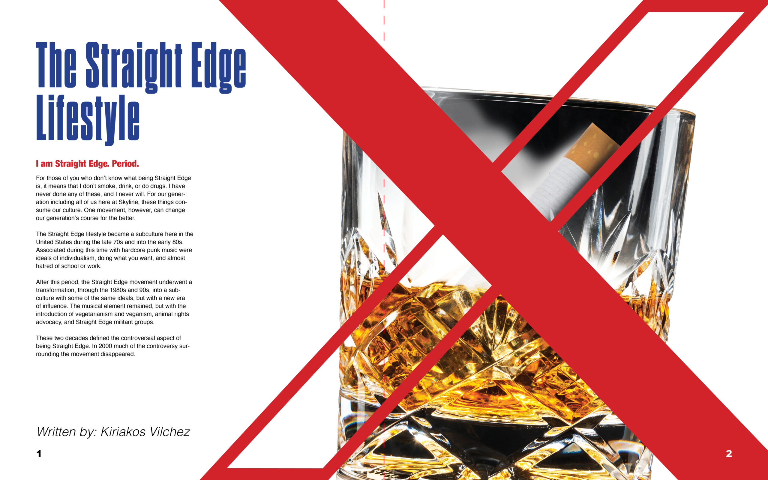
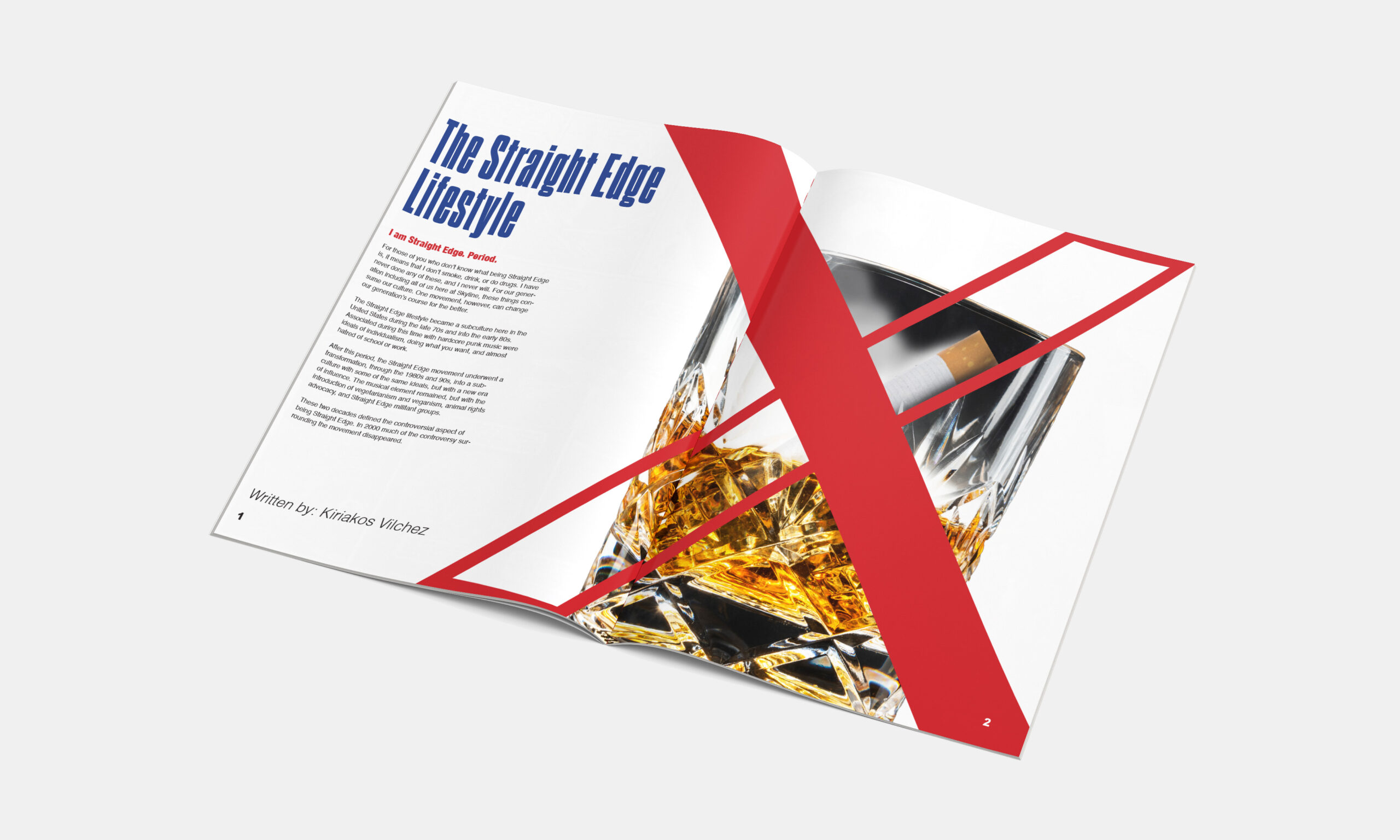
This design was made for a typography class in the fourth semester, where we had to create an opening spread for a magazine article. The article was written by someone explaining what "straight-edge culture" is. For those who don't know, it is essentially people who don't drink or do drugs, but in a cool way. I started with research and found that the symbol for straight-edge is an X, usually black or white, but I had the thought to mix the X with the prohibited symbol, which is typically red. I then added some of the items that most people in this community abstained from and placed them behind the X. This way. It is immediately inherent that the article is against substance use. I chose the font because of its sharp edges and flat sides, representing the attitude of straight-edge culture. I chose blue for the header to draw attention as it is the only cool color on the page and to show how "The Straight Edge Lifestyle" is different from everything around it.


(This mockup doesn't have the same dimensions as the original design. This can have an effect on the spacing of elements.)
