Reable
This was one of my school projects, the aim of which was to disrupt an industry and change human behaviour to reduce waste in landfills. I chose to focus my efforts on E-waste, as I found through research that it makes up 70% of toxic waste in landfills and can be prevented if taken care of correctly. Now that I had a basic idea, I just needed to flesh it out.
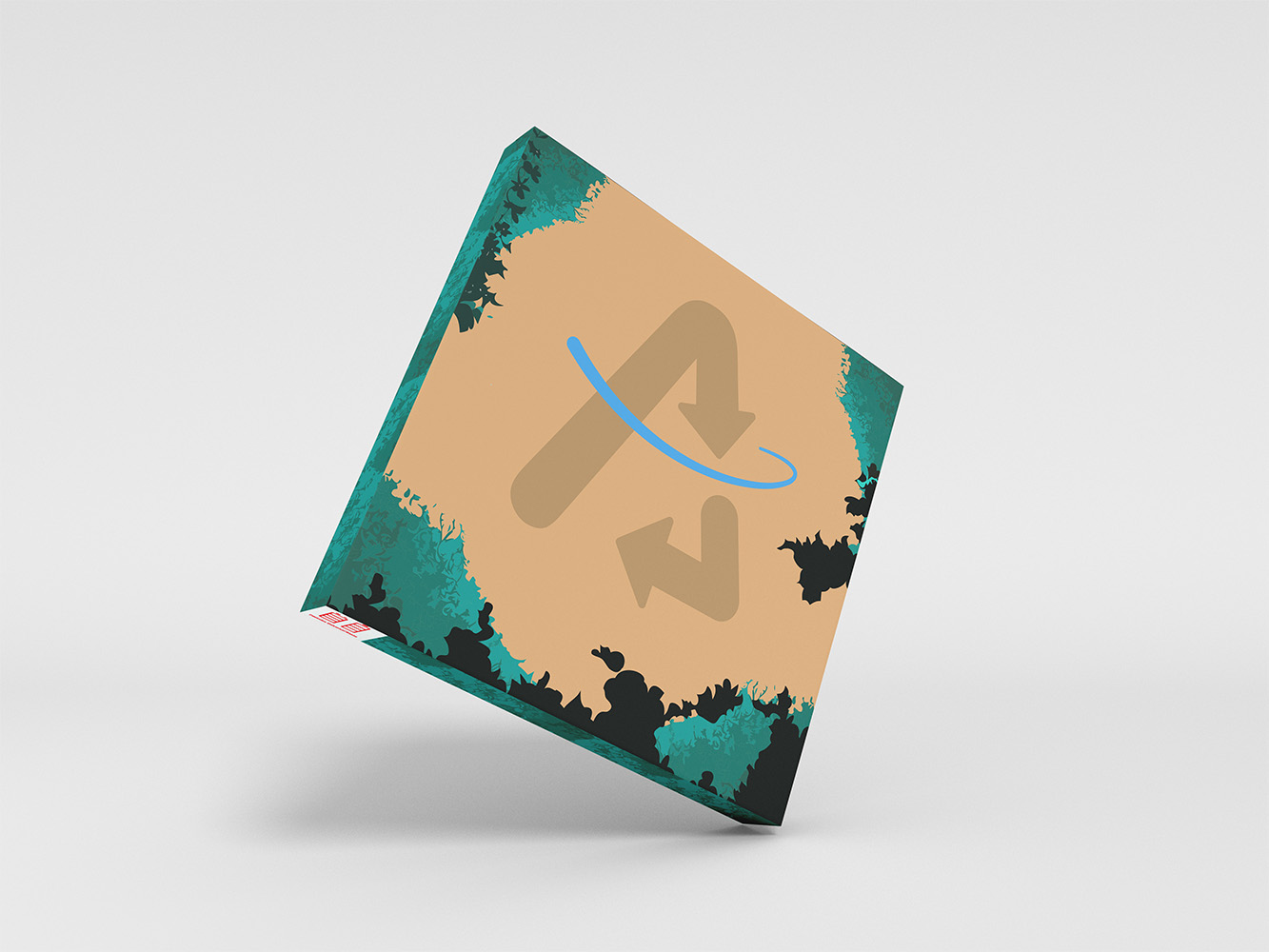
I kept researching and found that 95% of lithium batteries are recyclable, which is great. The only problem is that only 5% of them get recycled. This led me to create the first part of the brand, which I ended up naming Reable. The whole idea of the company was to create a way to make recycling/disposing of batteries and other e-waste convenient. This started with the "Sidecar," which was the first design I made. The Sidecar, shown above, would attach to the side of your garbage can and would be for batteries and other small electronics that you are getting rid of. These boxes would be picked up once a week like the rest of the recycling, and a new box would be dropped off. These boxes would make it more convenient for people to recycle e-waste because they can do it from home, and it attaches to the garbage so that you don't forget that it is there; it is also space effective.
The box's design uses simple graphics with flat colours, which is a style I tried to use across the whole brand. The vines around the outside frame the logo in the middle, which is a stylized recycling symbol made to look like an A. I wanted to keep the logo very simple because this is a new business with no competitors, so I chose recognition over creativity.
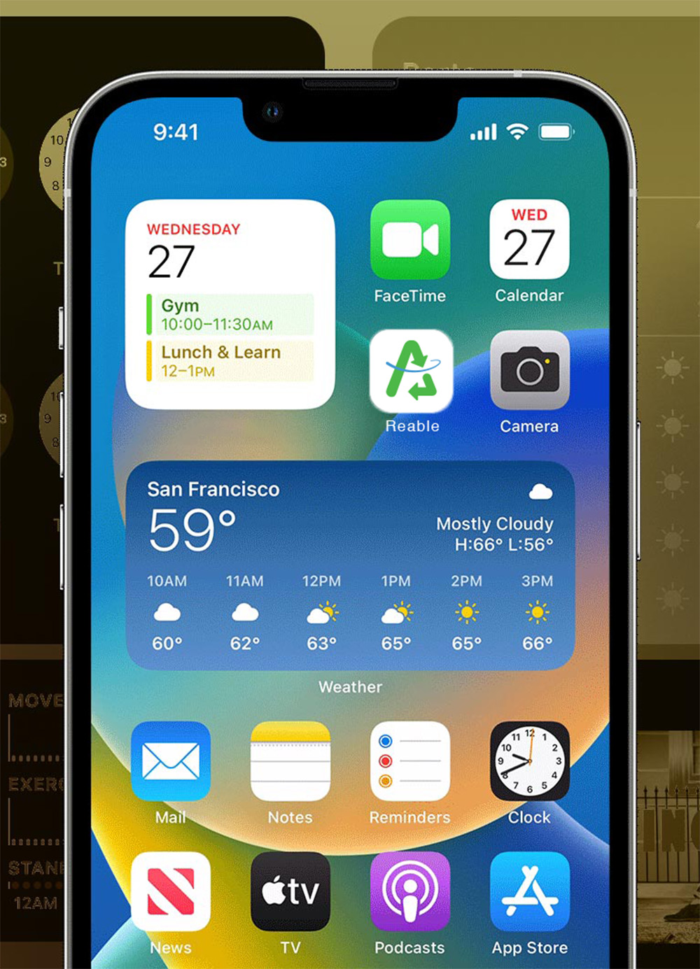
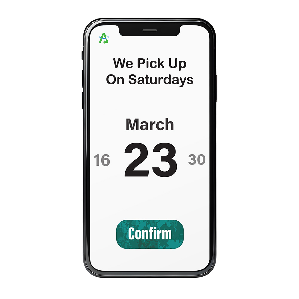
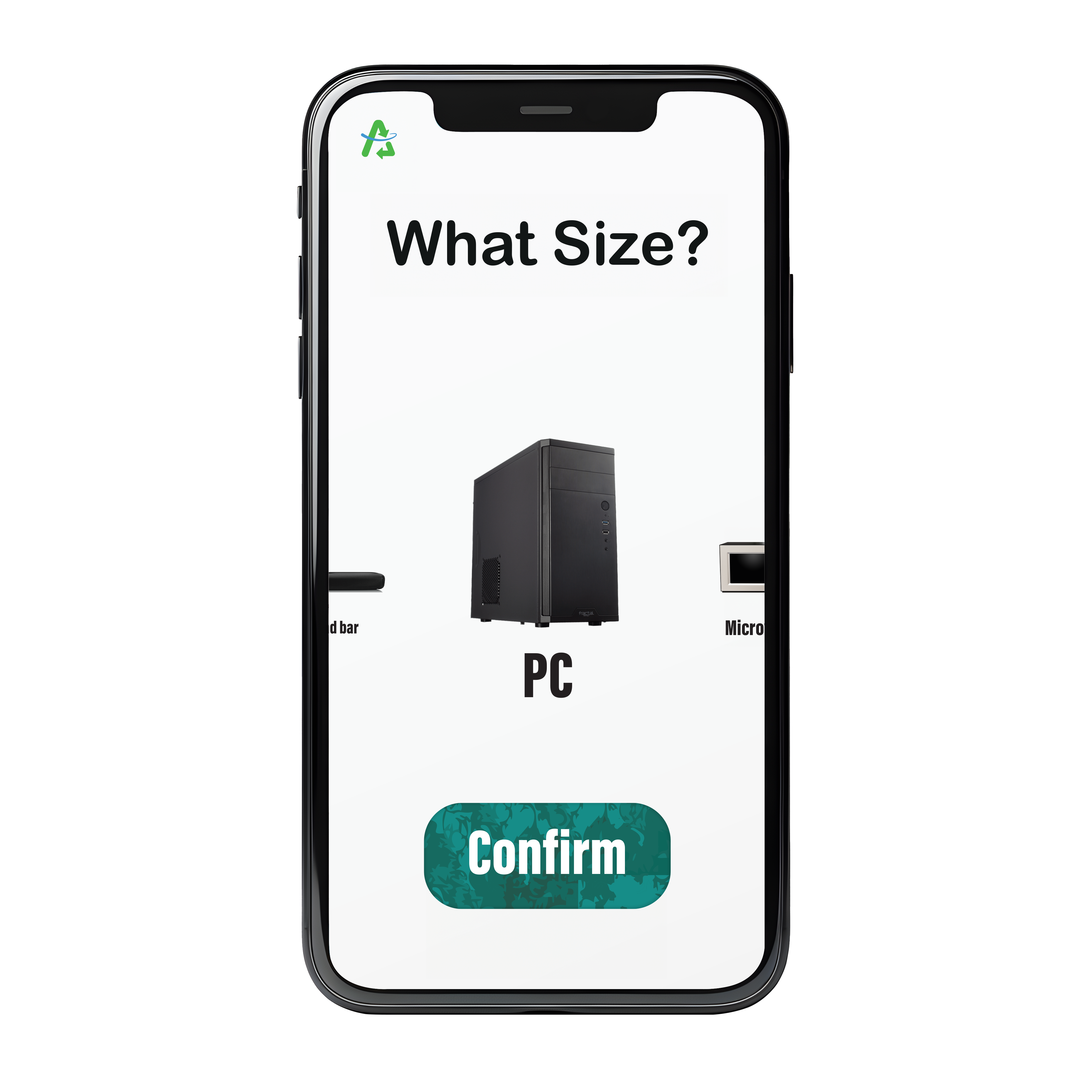
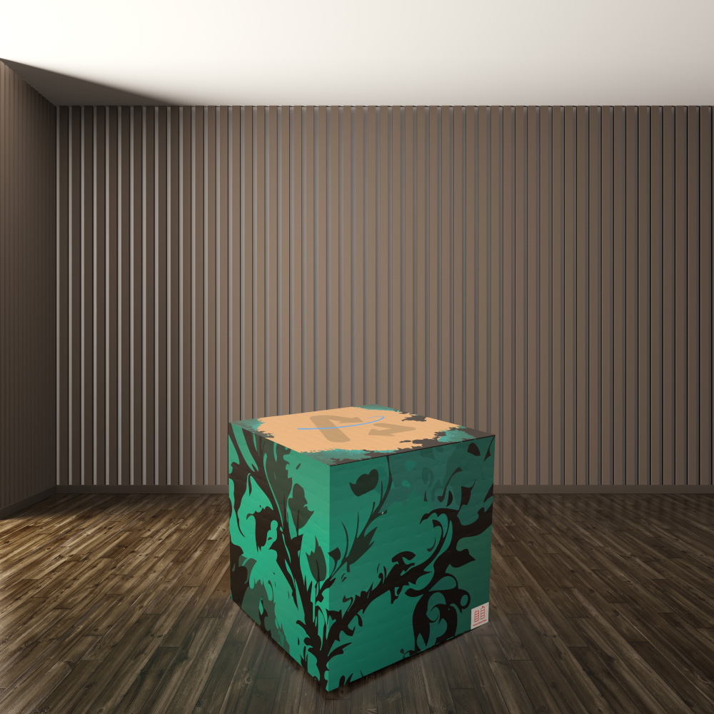
The next thing I worked on was a way for people to send back larger e-waste, such as a computer or toaster. I ended up designing an app where you can order different-sized boxes that will then be picked up on the date you check off. The goal of the app was to be as convenient as possible. The first time you open the app, you log in, and after that, the app only has three screens. The first two you choose the date you want the box picked up and the general size of the item. The third screen would be a timer that tells you when the box will be dropped off and the date they are picking it up. The idea of the box's design would be similar to the Sidecar just different sizes depending on the size that was chosen in the app.
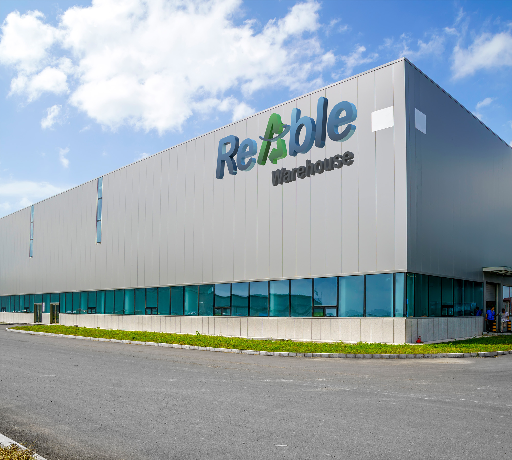
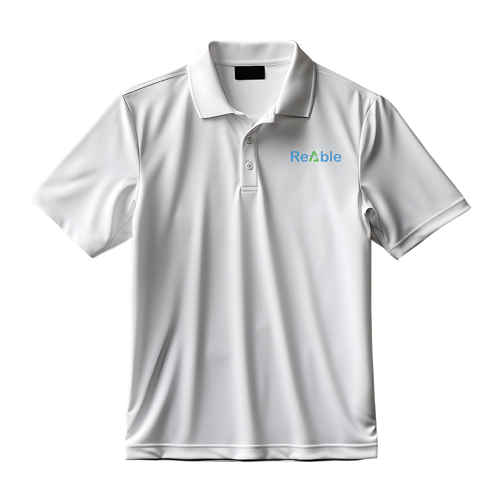
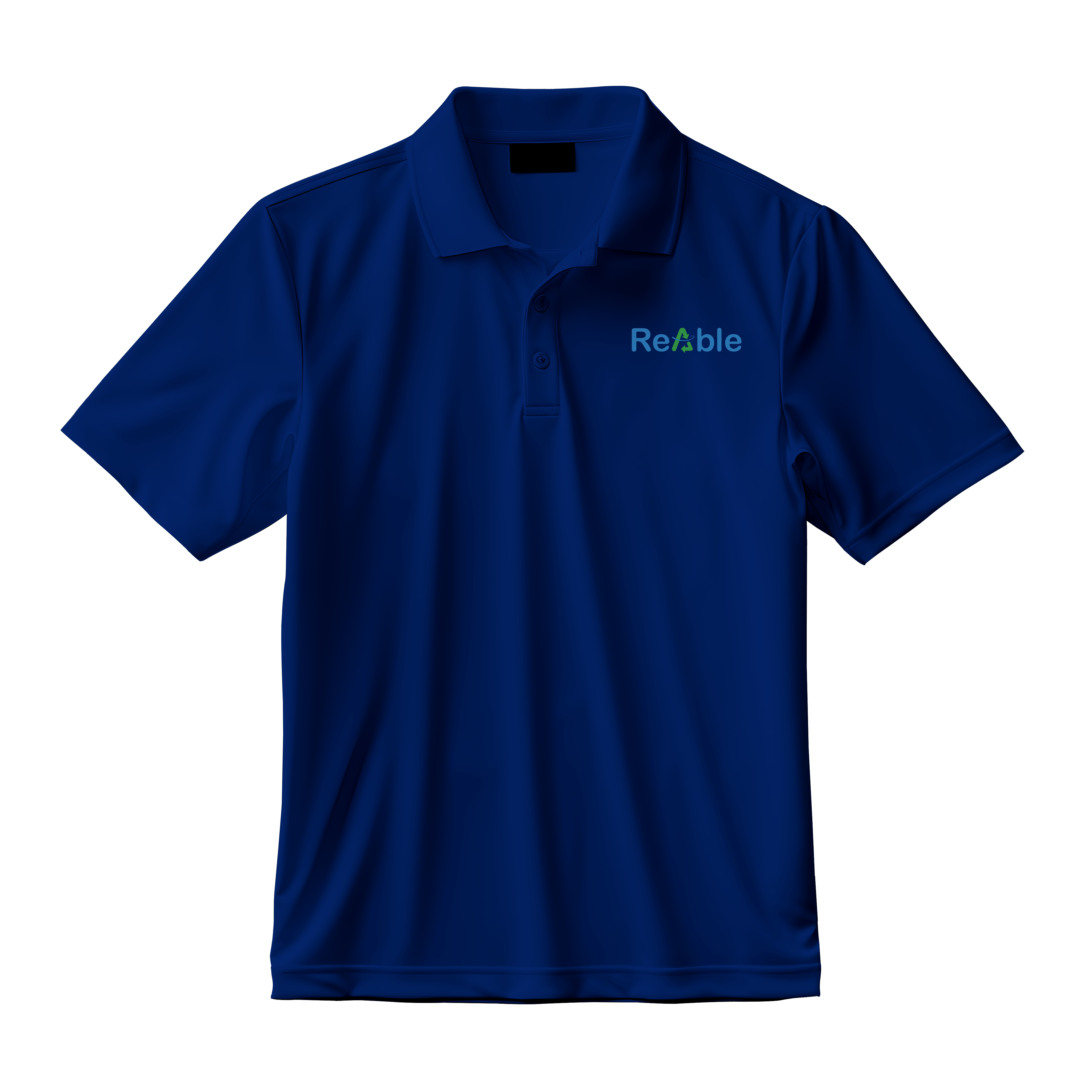
The following artifacts I worked on were those connected with the physical location. In this case, they were just signage uniforms. The sign is just the wordmark with any subheaders being in black below it. The shirts are simple polos set up in a tiered system, depending on how much authority the wearer has. The white is the lowest tier, just the base-level workers around the warehouse. The blue shirt would be for managers in the warehouse, and the black is for any corporate members visiting the warehouses.
Click the photo above to check out the full brand style guide


