Aquafina Prestige
Aquafina Prestige is a project I did for my second year of schooling. The project was focused around designing a new Aquafina product called Prestige. Our challenge was selling Prestige as high-end water for fitness-oriented adults even though it was technically the same as the original Aquafina.
I started by picking my target audience. Even though I had a broad range of "upper-class fitness-oriented adults," I needed to narrow it down to find good insights on one part of that group. In the end, I landed on branding toward celebrities who hike. At first, it sounds crazy, but I didn't have any budget to research people with a lot of money, so I decided to use celebrities as they tend to have more publically accessible records of what they do and don't like. The hiking part came from finding out that a lot of celebrities will go hiking as a form of exercise. Another benefit of branding towards celebrities is that if you are successful, having someone famous use your product is almost like free advertising because of their influence with their following.
I started my research by finding out what celebrities wear when they hike, as it could help find any common style between celebrities who hike. Sure enough, it seemed that the majority of celebrities would wear high-quality clothing that didn't have brand names on them. This insight led me to discover a style that is now called quiet luxury but has been around long before it was named. The gist of quiet luxury is that instead of paying for the brand name, you are paying for quality, which is essentially the opposite of Supreme.
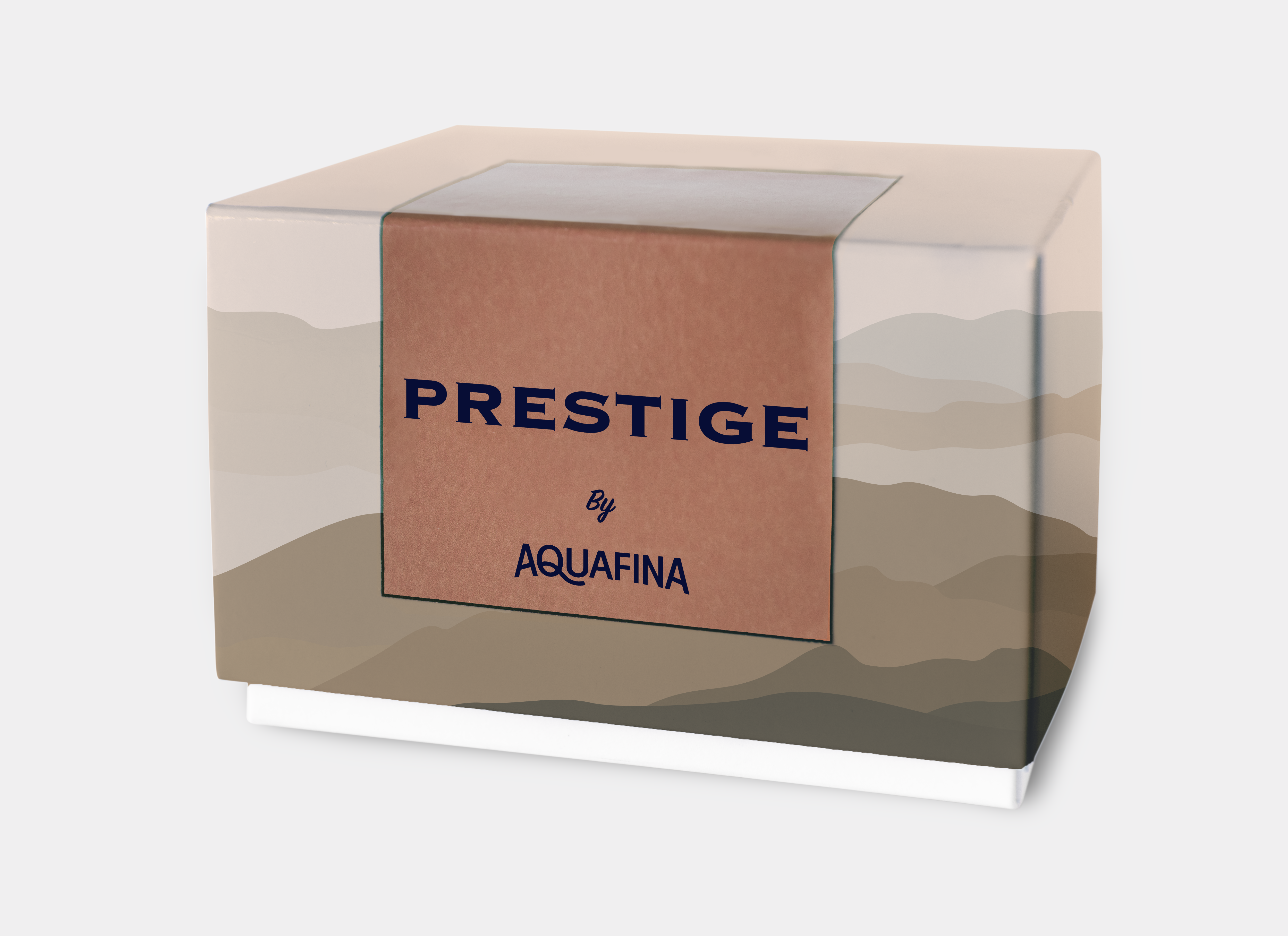
The first artifact I started working on was the box the bottle would come in. This is the only part of the product that clearly shows the brand name. I changed the name to Prestige by Aquafina simply because it sounds fancier. The background is inspired by a mountain range. Being branded towards hikers, it is nice to have an element that connects the box with nature. Another reason it was chosen is that neutral colours and organic shapes are elements of quiet luxury.
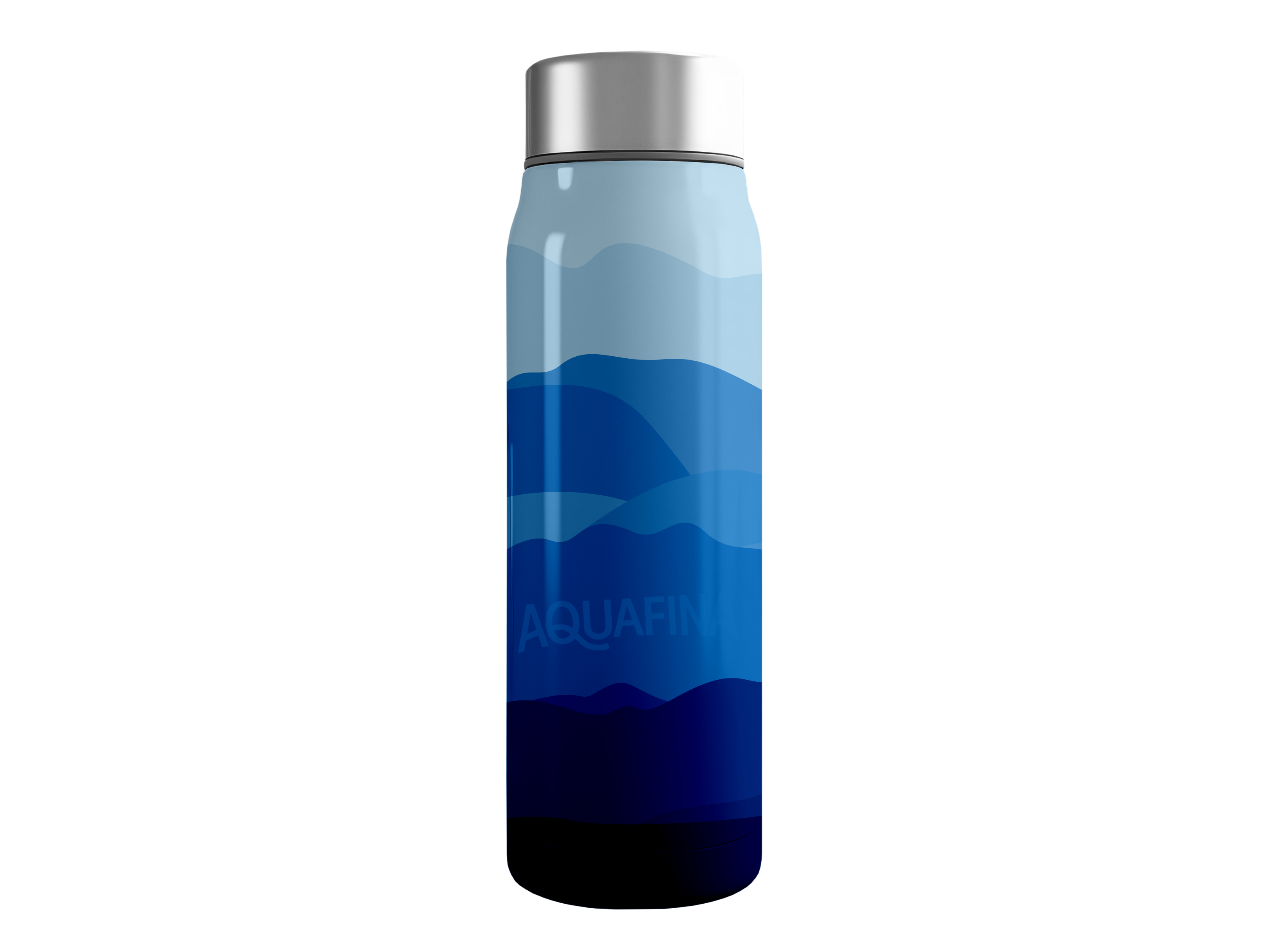
The next thing I worked on was the water bottle. The first thing I experimented with was what type of water bottle to make, and after hours of research and surveys, I concluded that there was no one-time-use bottle material that any avid hiker would choose. In addition, another part of quiet luxury is actually the sustainability of a product, so in the end, I chose to make it a stainless steel bottle. The actual design is very similar to the box to keep cohesion across the product. Originally, the brand name wasn't included at all, but "the company" wanted it included. The bottle comes in many colours, all monochromatic and natural.
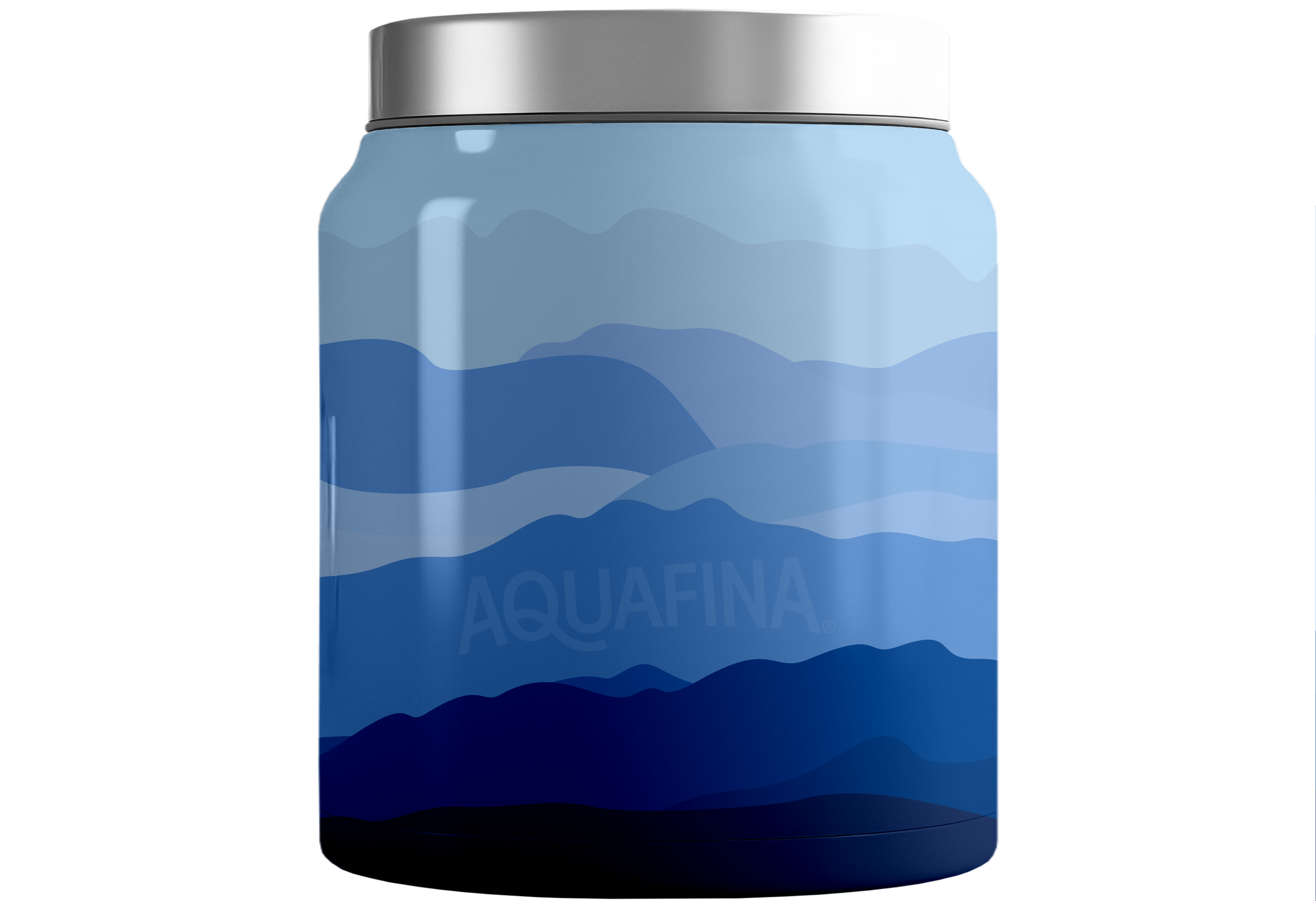
Above is an example of how the company could keep selling water even though the bottle was reusable. This is a jug of water that would be delivered once a week through a subscription service. Aquafina has a method of filtration that has seven steps to make sure the water is as pure as possible. Celebrities don't all love going out in public, and a delivery service would also combat this problem. The purest water and delivery are two selling points that would incentivize people to buy Prestige over other brands. Also, the jug would keep the water cold without needing to use power, which is another upside.

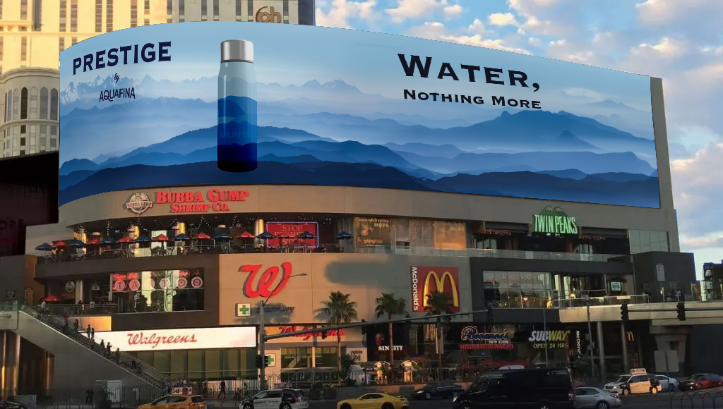
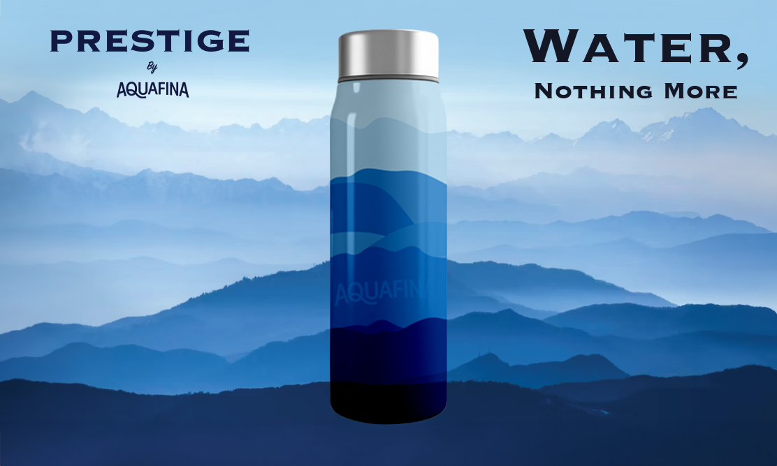
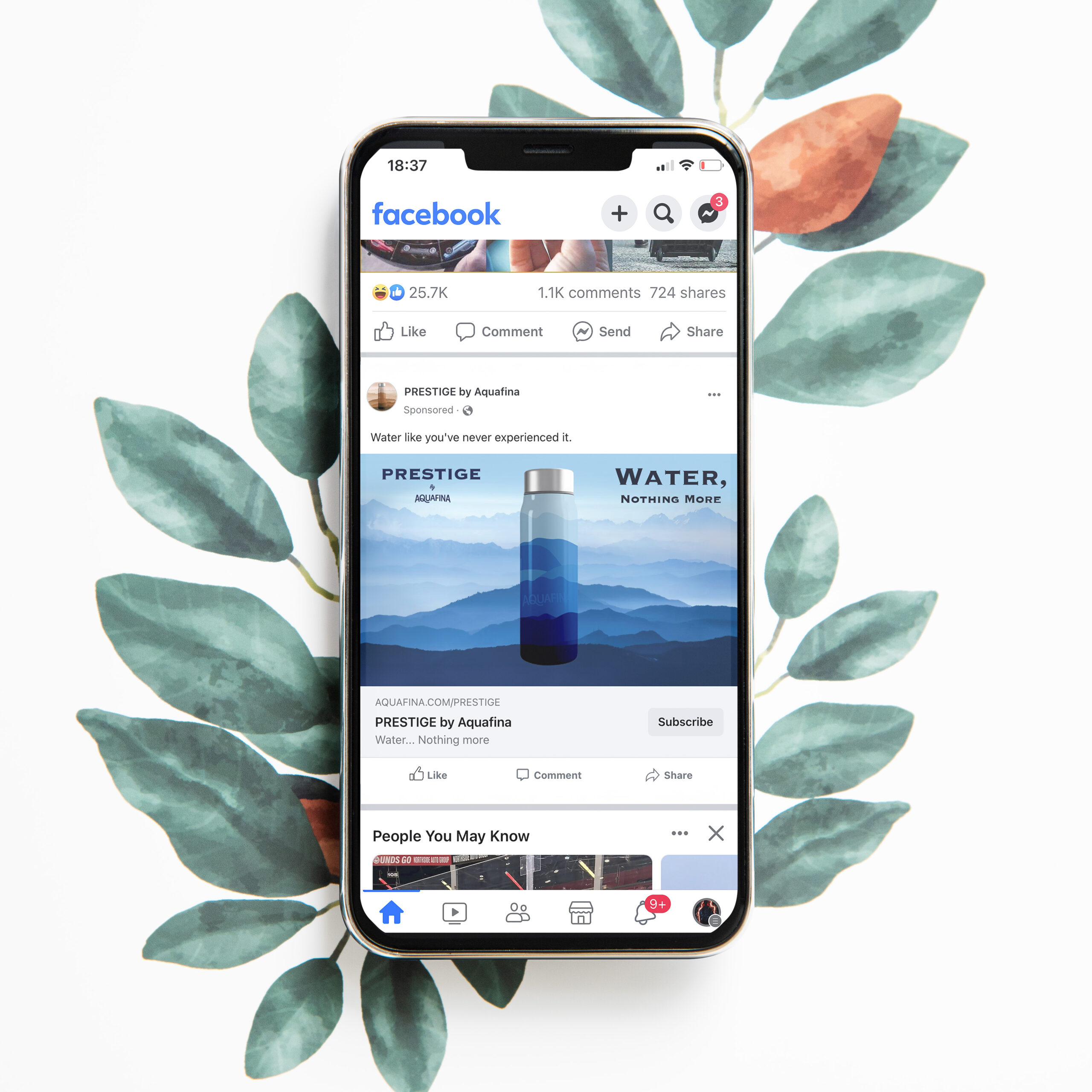
I wanted to continue using the idea of pure water in the advertising with the tagline "Water. Nothing More." This mirrors Aquafina's tagline, which is "Pure Water. Perfect Taste." I changed it so the product could seem more distanced from Aquafina's regular water. The focus of the ads was to show the connection to nature through the mountain range, which completes the illustration on the bottle. The design mimics the calm that comes when you reach the peak during a hike and take a minute to enjoy the view.
Above are different variants of the ad, and then mock-ups showing where they might be placed.

